23 Proven LinkedIn Profile Picture Examples
Your LinkedIn profile picture is critical in making a good first impression online and is a key piece in establishing a trustworthy personal brand.
People will judge you (and what you sell) based on how you present yourself.
So avoid using images that are unclear, cluttered or outdated.
Or WORSE using no image at all! (Yes, sadly we see this alot)
Instead:
- Use a recent photo that has a good likeness (i.e. taken in the last 3 years)
- Use a high-resolution image (LinkedIn recommends 400 x 400 pixels)
- Choose an image where you appear approachable and friendly
- Ensure your face makes up at least 60% of the image
- Get someone else to take the photo (or use a tripod)
- Blur or mask natural backgrounds
- Be the only person in the frame
Bonus tip: You can use Canva's background remover tool to isolate your headshot, then add a simple background that aligns with the colour(s) you wish to associate with your brand.
Here are 22 examples of profile pictures done well:
1. Filipa Canelas: One Colour
%20(1).png)
Pro tip: Use a high-resolution image (LinkedIn recommends 400 x 400 pixels).
2. Jay Clouse: Subtle Gradient
Pro tip: Use Canva's background remover tool to isolate your headshot, then add your brand colour(s).
3. Jon Brosio: Black & White
.png)
Pro tip: Get someone else to take your photo or use a tripod (no selfies or holiday snaps).
4. Matt Gray: Natural Background (Blurred)
.png)
Pro tip: Blur natural backgrounds and ensure you (the subject) remain in sharp focus.
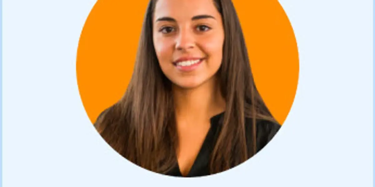
5. Justin Welsh: Solid Black
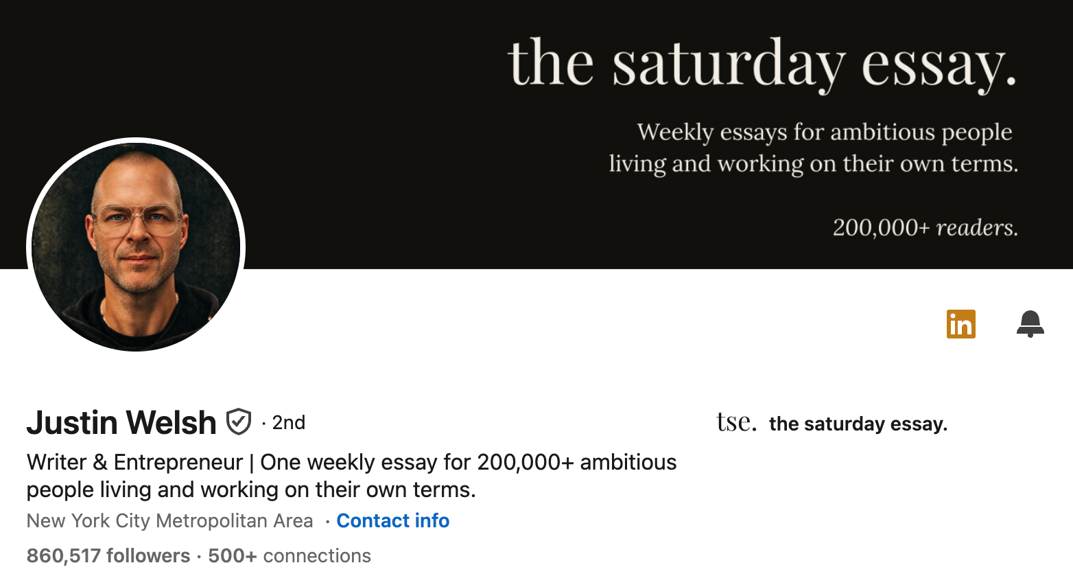
Pro tip: Crop your photo so you take up ~60% of the frame. This ensures sharpness on mobile.
6. María de la Puente: Approachable Expert
.png)
Maria is the CEO of Hubapps but that doesn't mean it's all work and no play. Especially in her field of mobile gaming.
Pro tip: A soft, single-colour background keeps you looking warm and approachable while your direct gaze still reads as credible. Friendly and authoritative are not opposites.
7. Dakota Robertson: Subtle Linear Gradients
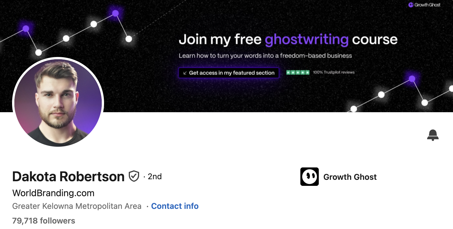
Pro tip: Much like a well-lit room, subtle gradients create an ambient image.
8. Bethany Jewkes: Live your Brand
.png)
Pro tip: Using a subject photo really helps your profile picture stand out.
9. Ayushi Bansal: Inner Circle
Pro tip: Use an image where you appear approachable and friendly.
10. Luke Matthews: One Colour + Outline
Pro tip: Use a contrasting colour for the photo's outline to make it pop.
11. Nick Broekema: One Colour + Noise
Pro tip: Soft light is best. If outside, aim for the golden hours.
12. Sarah Hart: Two Colours
Pro tip: Challenge conventions with a split-coloured background.
13. Jacob Pegs: B&W Subject + One Colour
Pro tip: Looking away from the camera can create a more relaxed vibe.
14. Ruben Hassid: One Colour + Vignette + Outline
Pro tip: Remove backgrounds with Canva or remove.bg
15. Dan Koe: B&W Subject + Backlit Glow
.png)
Pro tip: Blur natural backgrounds so you remain the focus. Backlight to evoke a specific mood.
16. Jane Kisnica: B&W Subject + One Colour + Outline
Pro tip: Using a shadow effect behind the subject gives a 3D look to the image.
17. Tommy Geoco: Stylized Subject + One Colour
Pro tip: Opting for an illustration rather than a photo can help to stand out from the crowd.
18. Lea Turner: Subject Outline + Branded Design
Pro tip: For a cohesive approach, use design elements that reflect your personal or company brand.
19. Chris Do: Branded Emblem Logo
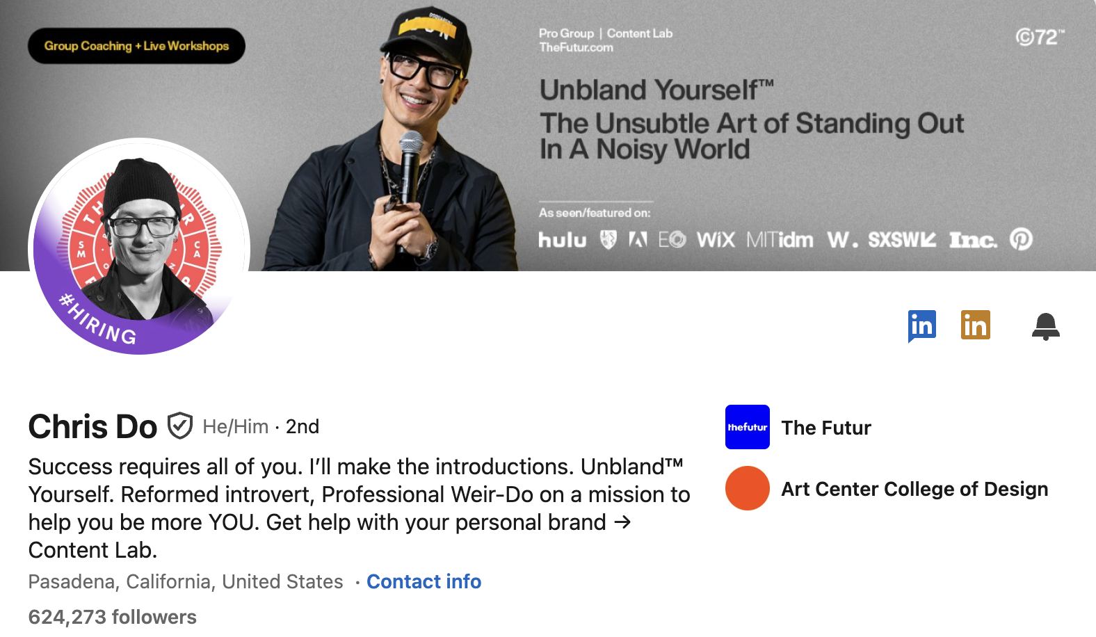
Pro tip: Including a brand emblem logo is a smart advertising move and helps compound brand recognition.
20. Katelyn Bourgoin: One Colour + a Smile Wins the Day
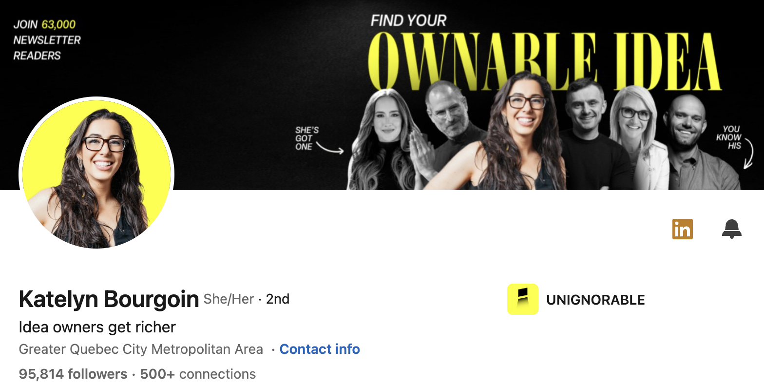
Pro tip: Using a bright, primary colour for the background can really make your headshot pop. It also helps that Katelyn has a great smile!
21. Amanda Natividad: Natural Background
.png)
Pro tip: Blur natural backgrounds and ensure you (the subject) remain in sharp focus.
22. Anna York: Signature Prop / Personal Style
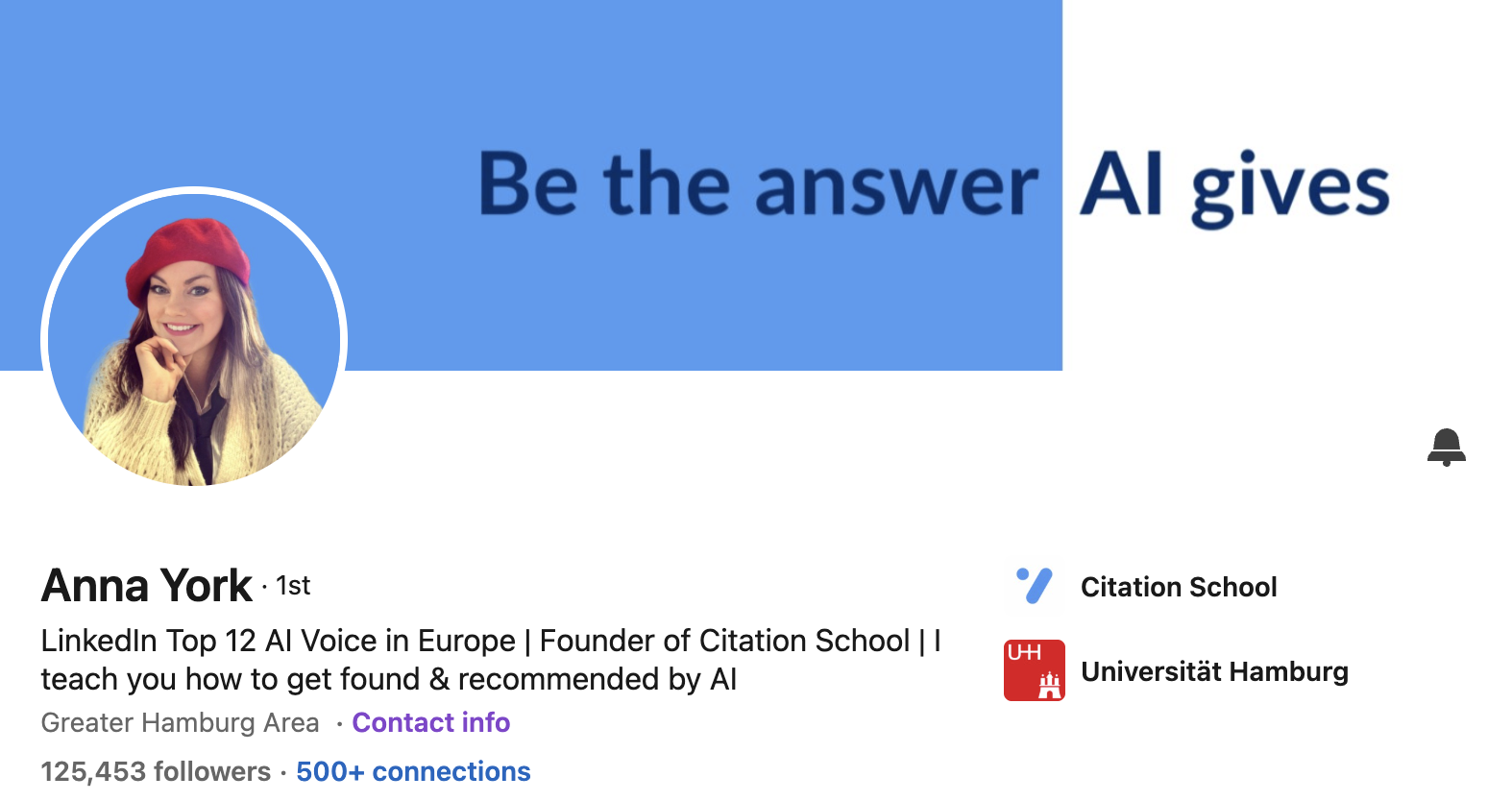
Pro tip: A signature item like a hat or a bold colour makes you instantly recognisable across the feed. One memorable visual detail does more for recall than a perfect neutral headshot.
23. Lisa Steingold: Use props
.png)
Pro tip: Don't be afraid to add personality with props. We love how Lisa has added a touch of personality with a cycling helmet showing it's not all work with no play.
LinkedIn Profile Picture Mistakes to Avoid
A good photo builds trust. A bad one quietly costs you opportunities before anyone reads a word. Avoid these.
- ❌ Group photos. If there are three faces in the frame, a visitor has to guess which one is you. Be the only person in the shot, every time.
- ❌Cropped-out exes and obvious cut lines. A stray arm on your shoulder or a jagged crop where you removed someone screams low effort. Use a clean solo photo instead.
- ❌Holiday snaps and selfies. A sunburnt selfie from a beach bar is not a professional first impression. Get someone to take the photo, or use a tripod.
- ❌Alcohol, drinks, or anything in hand. A glass of wine or a pint in your profile picture sends the wrong signal to a recruiter or client. Keep hands and props out of it.
- ❌Anything revealing or off-brand. Beachwear, gym mirror shots, naked shoulders, or overly casual clothing undercut your credibility. Dress the way you would for the people you want to attract.
- ❌Sunglasses, hats that hide your face, or heavy filters. People connect with faces. If they cannot see your eyes, the trust signal is gone. (A signature item like Anna York's beret works because it frames the face rather than hiding it.)
- ❌Pets, cars, and logos as your main photo. Your dog is lovely, but the profile picture is for your face. Save the personality touches for your banner.
- ❌Outdated photos. If the picture is more than three years old and you no longer look like it, you create an awkward gap the moment you meet someone. Keep it current.
- ❌Low-resolution or blurry images. A pixelated photo suggests you do not sweat the details. Upload at least 400 x 400 pixels and check it looks sharp on mobile.
- ❌Distracting or cluttered backgrounds. A busy room pulls focus off your face. Blur it, mask it, or swap in a clean single colour.
Bottom Line
Photos matter! Make sure your photo makes people want to connect with you.
Want to rock your LinkedIn? Get our
- LinkedIn Post templates,
- LinkedIn Carousel templates
- and hook templates
to get your audience engaging!