20 Proven LinkedIn Banner Image Examples
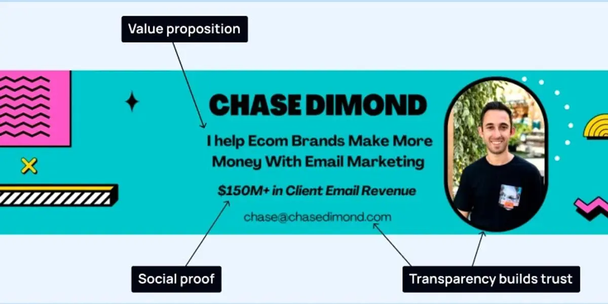
Your LinkedIn banner is the biggest piece of space on your profile, and most people leave it as a default blue rectangle.
Don't waste the opportunity!
Just like you decide whether to watch a Netflix series in the first 5 seconds, people decide whether to engage with you based on your banner and profile.
Before anyone reads your headline or scrolls your posts, they see your banner. It sets the tone in a second. Treat it like a shop window: clear, visual, and built to make one point well.
The hard part is knowing what to actually put there. So instead of a vague "be creative", here are the proven banner types that work, a real example of each, and why each one does its job. Find the type that matches your goal, then copy the thinking, not the pixels.
First, the three jobs a banner can do. Most strong banners pick one:
- Value proposition: what you do, who you help, and why you are different.
- Social proof: client logos, media features, follower counts, results.
- Call to action: the next step you want a visitor to take.
If you really want to build your personal brand on LinkedIn, you're going to need to leave a great impression.
Here are 20 examples of banner images done well:
1. Chase Dimond: Service Offering
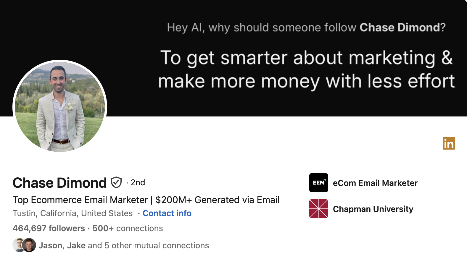
Chase leads with a clear service offering, so a visitor knows exactly what he sells the moment they land. There is no guessing and no scrolling required. For consultants and freelancers whose profile visits are warm leads, this is the fastest way to turn a click into a conversation.
2. Eddie Shleyner: Newsletter
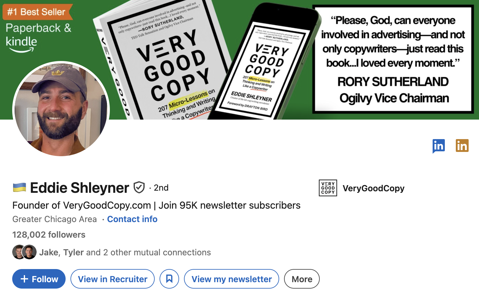
Eddie uses the space to promote his newsletter. It is free advertising to everyone who visits, and it converts a passive profile view into a subscriber. That matters because a subscriber is someone you can reach again on your own terms, off the platform.
3. Lara Acosta: Drive traffic to another channel
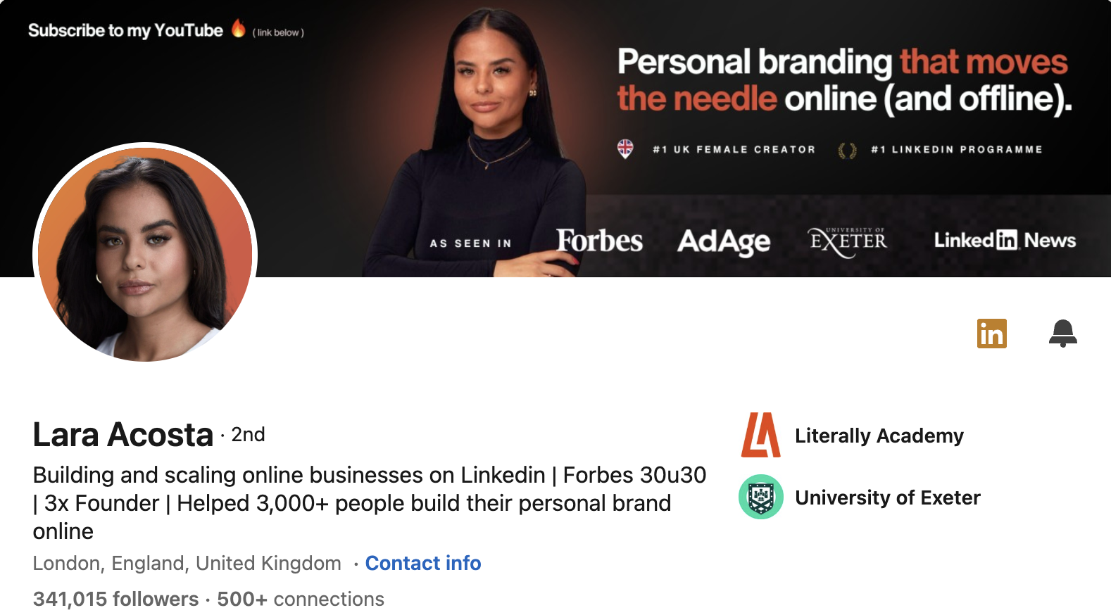
Lara points profile visitors to her YouTube channel. Rather than letting a visit end on LinkedIn, she extends it into an ongoing relationship somewhere she controls more of the experience. One profile view becomes a subscriber on another platform.
4. Nausheen I Chen: Upcoming event
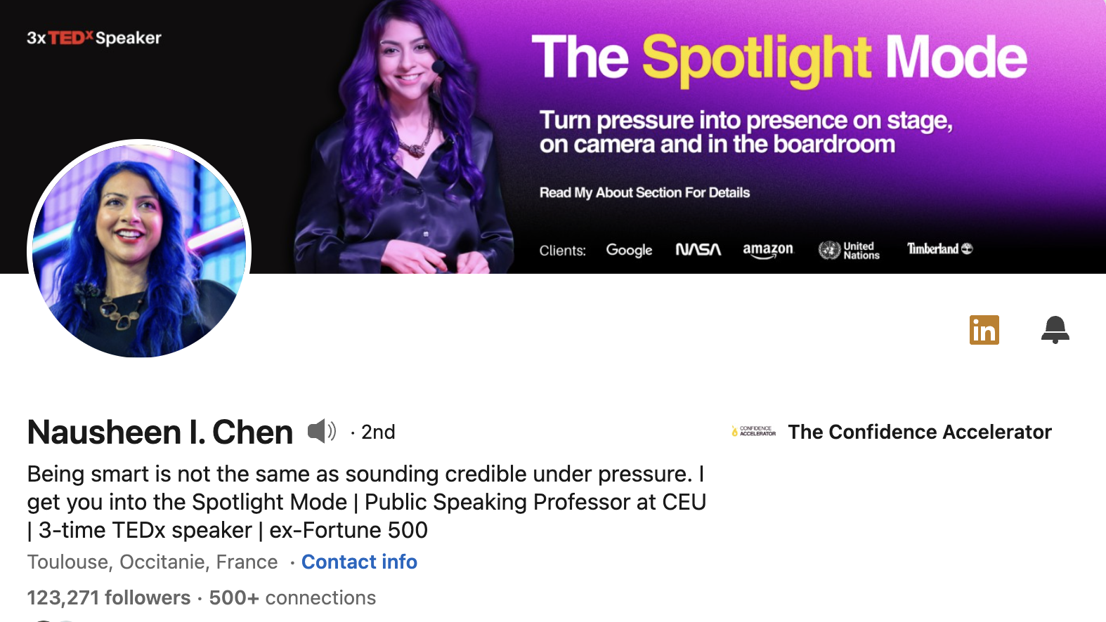
Nausheen flags an event with a clear date. It pairs urgency with an obvious next step. Because banners are quick to swap, this is a smart way to use your profile as a rolling billboard for whatever is current, then change it back afterwards.
5. Chris Do: Value proposition
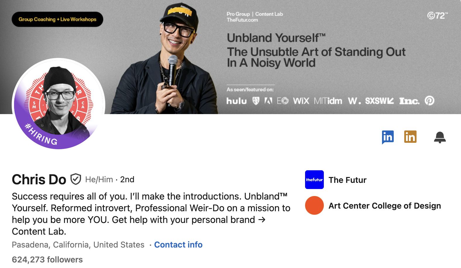
Chris states a sharp value proposition that positions him instantly. In one line a visitor understands who he helps and why he is different. This answers the only question a new visitor is really asking: is this person for me?
6. Eric Partaker: Promotion
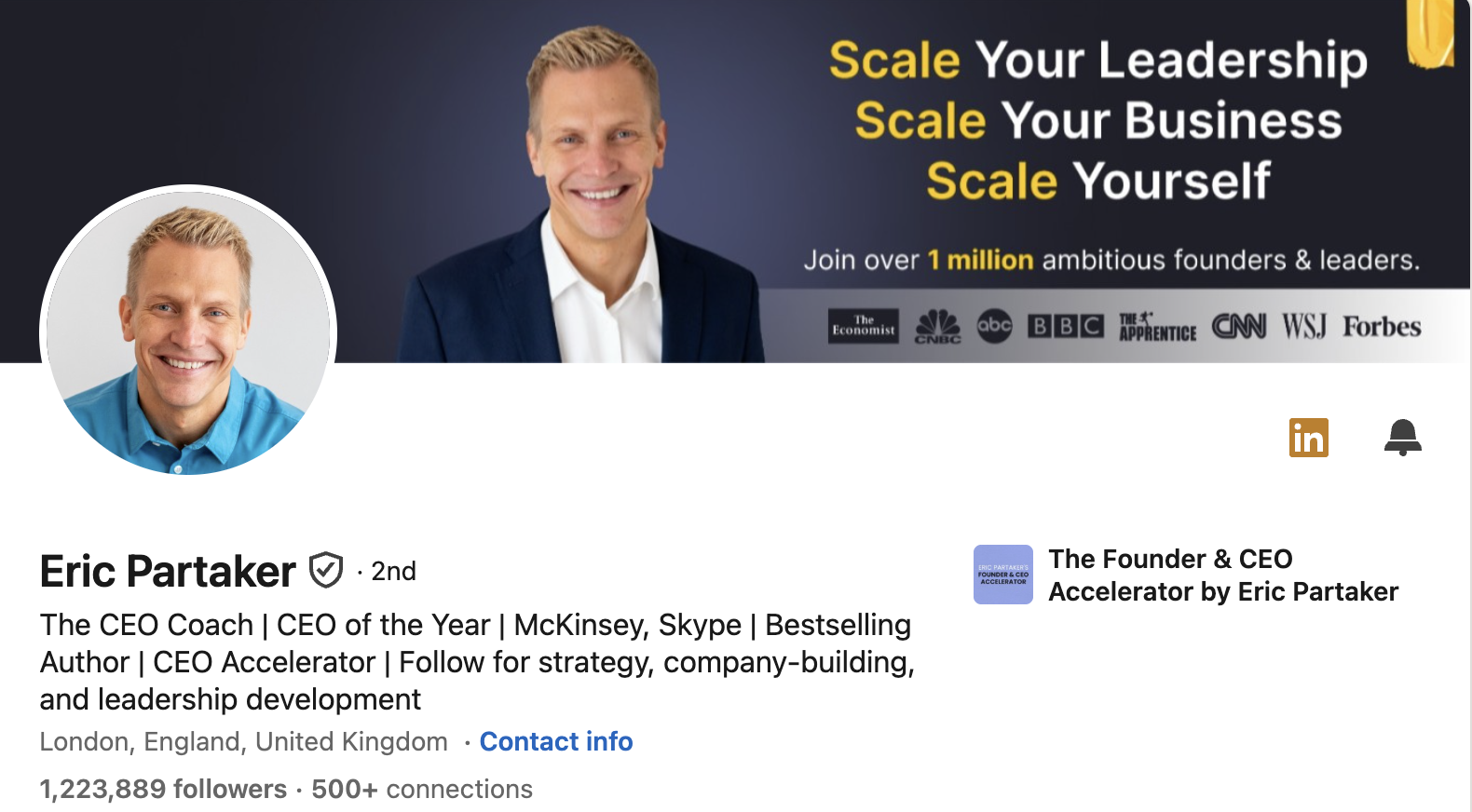
Eric funnels readers to drive buy in through promotion. He lists the brands he's worked with and shows you that 1 million other people believe in his work, and so should you!
Like Chris Donnelly, he treats the banner as a subscription driver. The lesson is that if you have an owned channel, your banner is the cheapest place to grow it.
7. Katelyn Bourgoin: Sneak peek
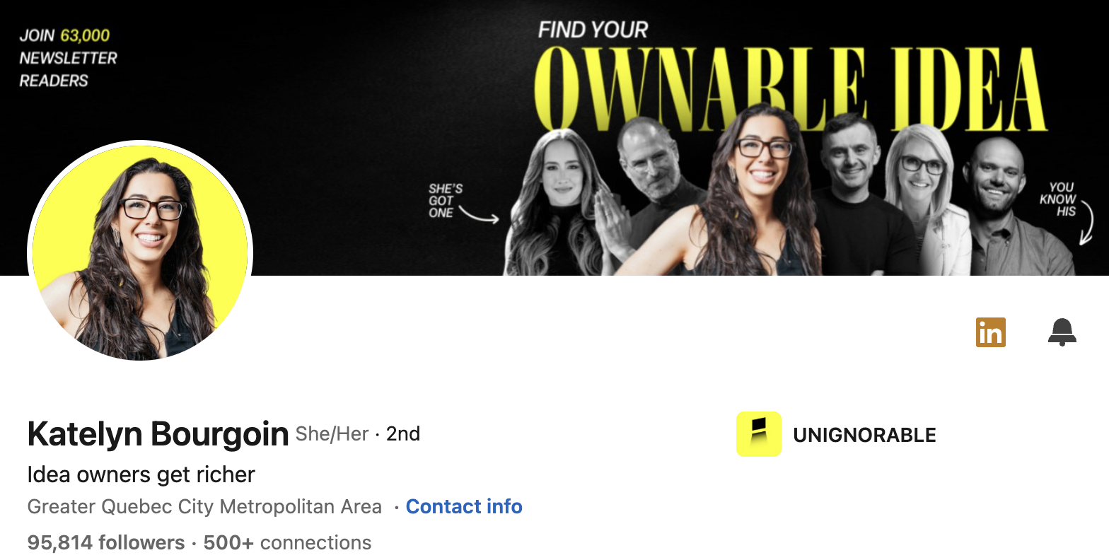
Katelyn offers a sneak peek that rewards curiosity. It gives a first-time visitor a reason to look closer and come back. Teasing what is coming creates a small open loop that people want to see closed.
8. Dakota Robertson: Lead magnet
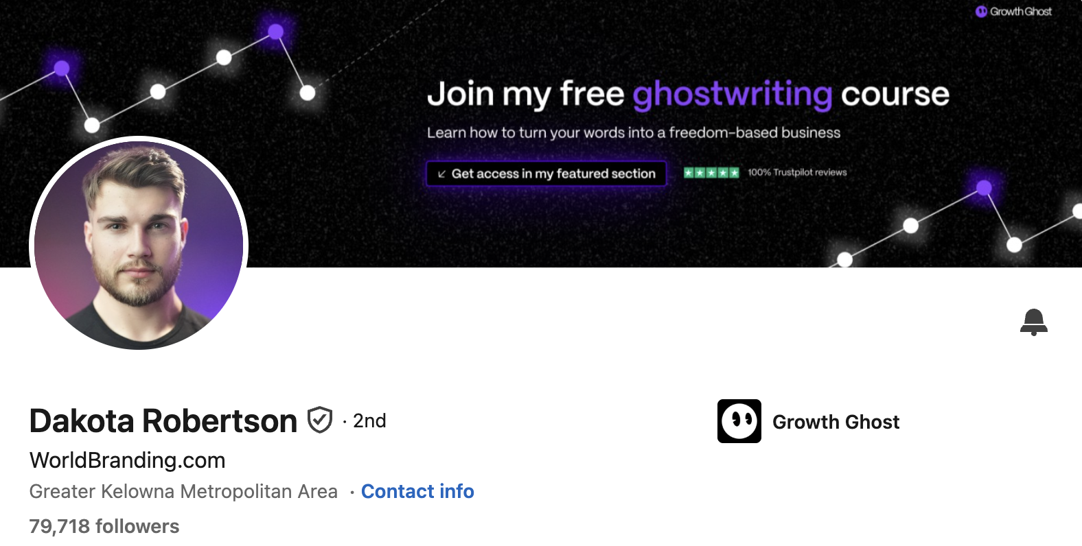
Dakota points visitors to a free lead magnet. It gives a first-time visitor a low-risk way to engage before they ever buy. A useful freebie builds goodwill and, if it captures an email, gives you a way to follow up.
9. Riya Tiwari: Service offering
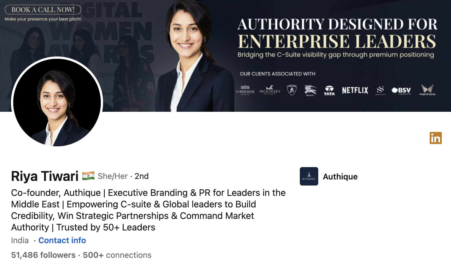
Riya spells out her service offering with no ambiguity. The clearer the offer, the faster a prospect can decide. For service providers, clarity on the banner does quiet sales work on every single profile visit.
10. Rick Bryce: Professional
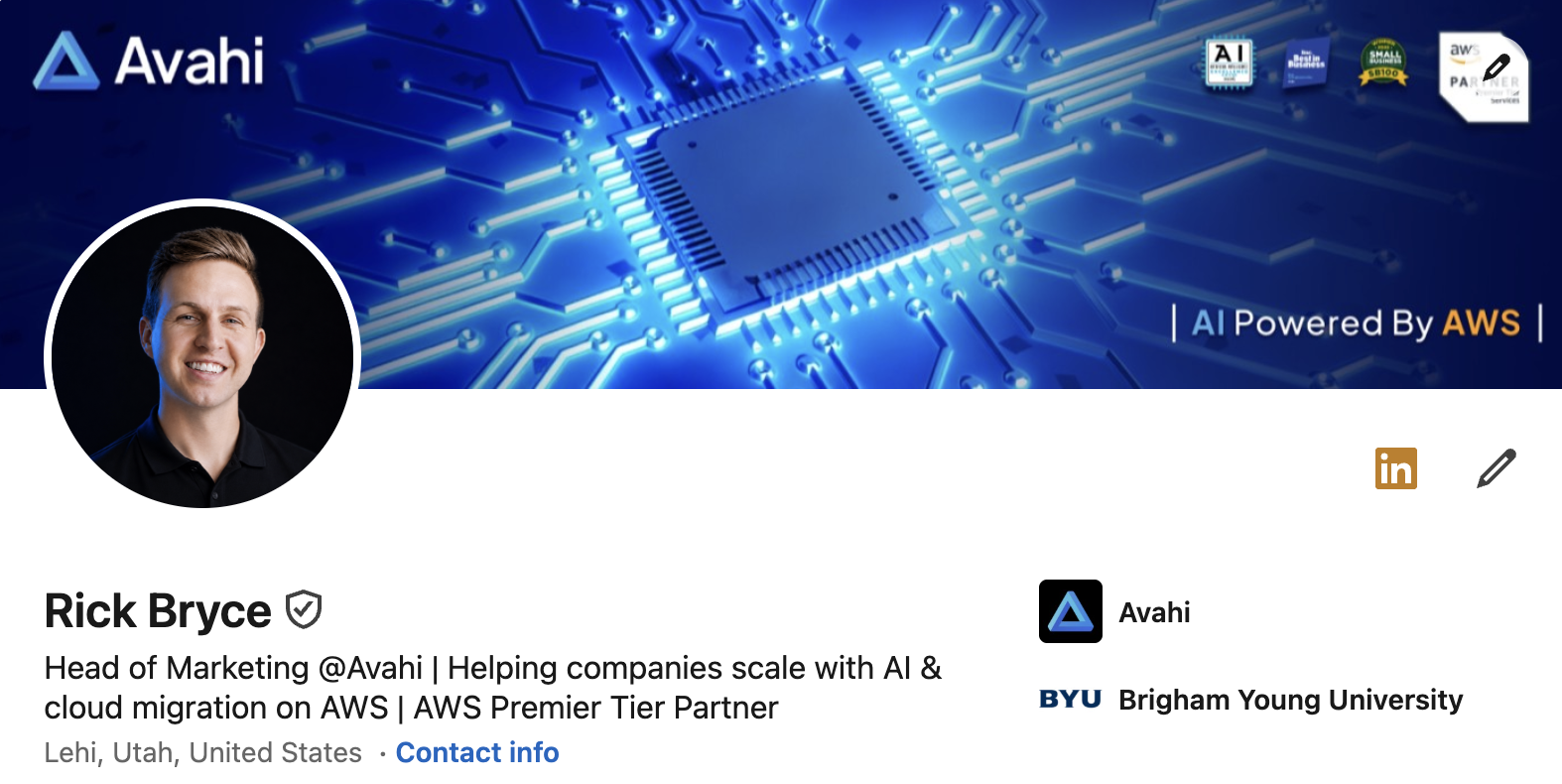
Rick is a great example of what a professional banner could, and should, look like! It's clear and simple but also inspired curiosity.
Rule for for a professional banner - tell people what you do and inspire confidence!
11. Tyler Denk: LinkedIn Founder Banner
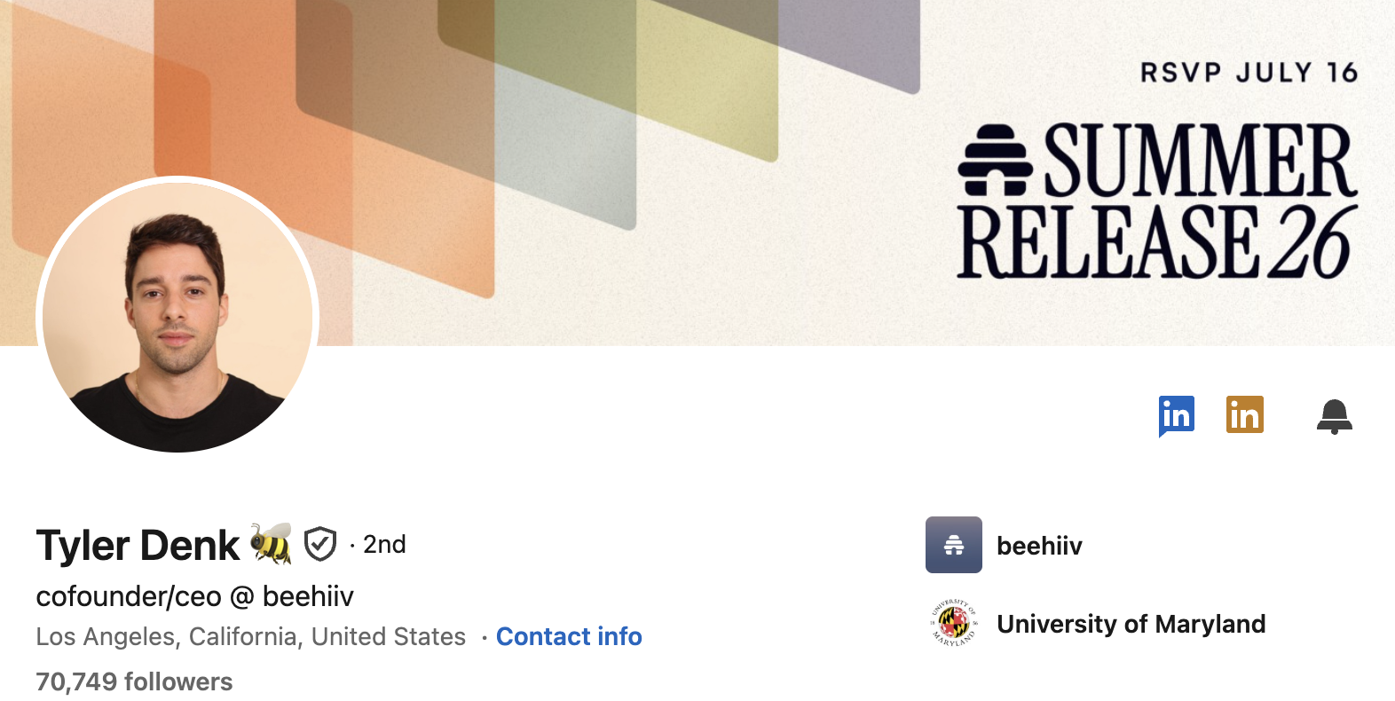
Tyer is a great example of a what to do as a founder on LinkedIn. He actually often changes his banner and always inspires his followers to get involved.
12. Snoop Dogg - Just for Fun
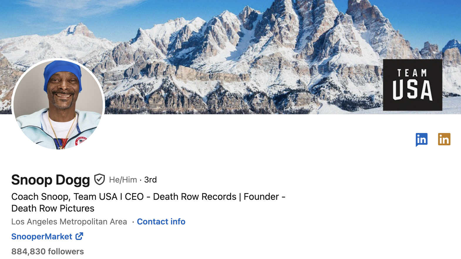
Who would've thought that Snoop Dogg would have a LinkedIn profile. But he does! And it's great!
He's used his to promote Team USA. Why not?
13. Yolanda Zaw: Make it Fun
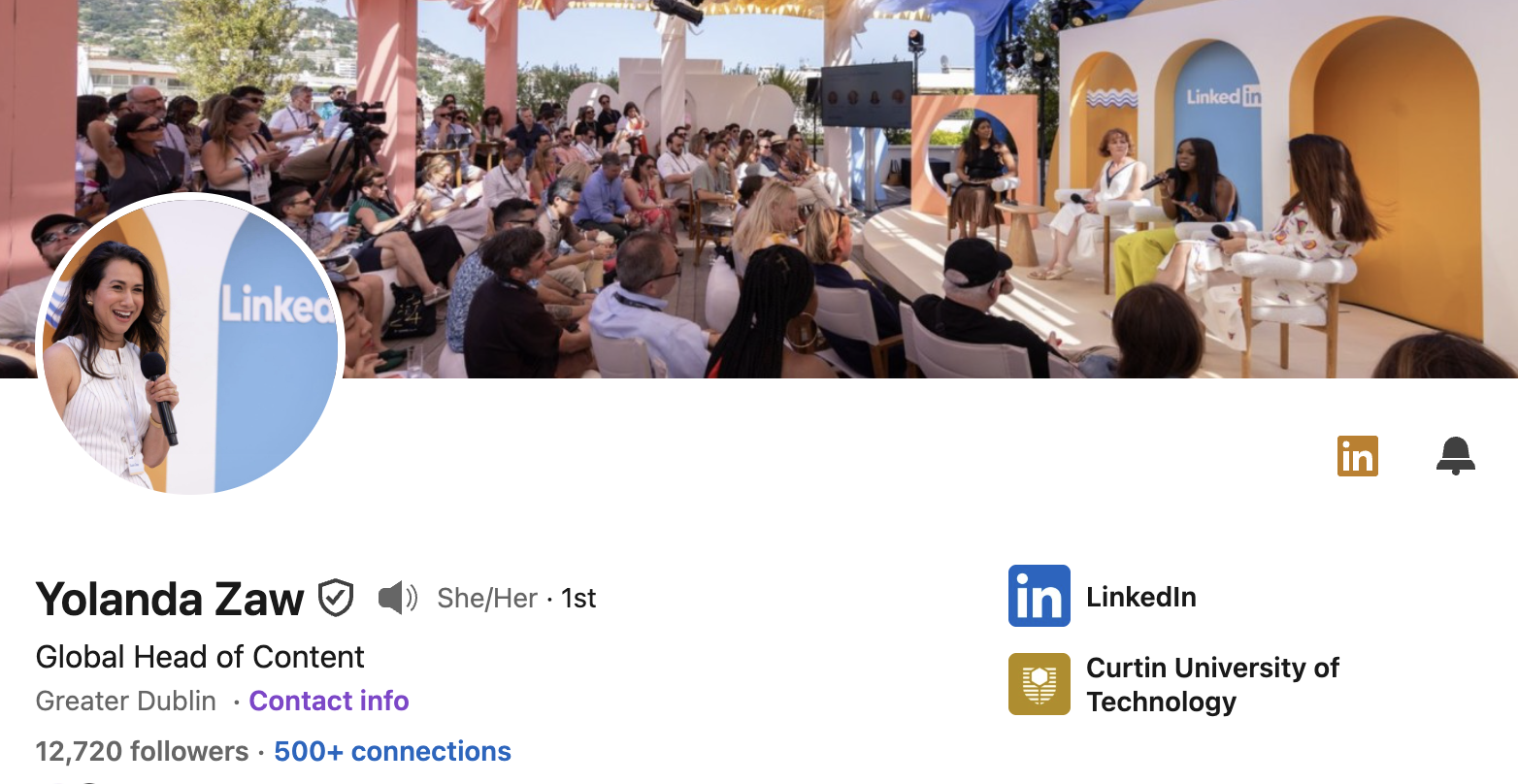
We simply LOVE Yolanda's use of colour. Looking at her profile just makes you want to connect and be in her presence!
As Global Head of Content for LinkedIn, we wouldn't expect anything else!
No surprise that she's a Top Voice on LinkedIn
14. Rob Hoffman: The Trust Factor
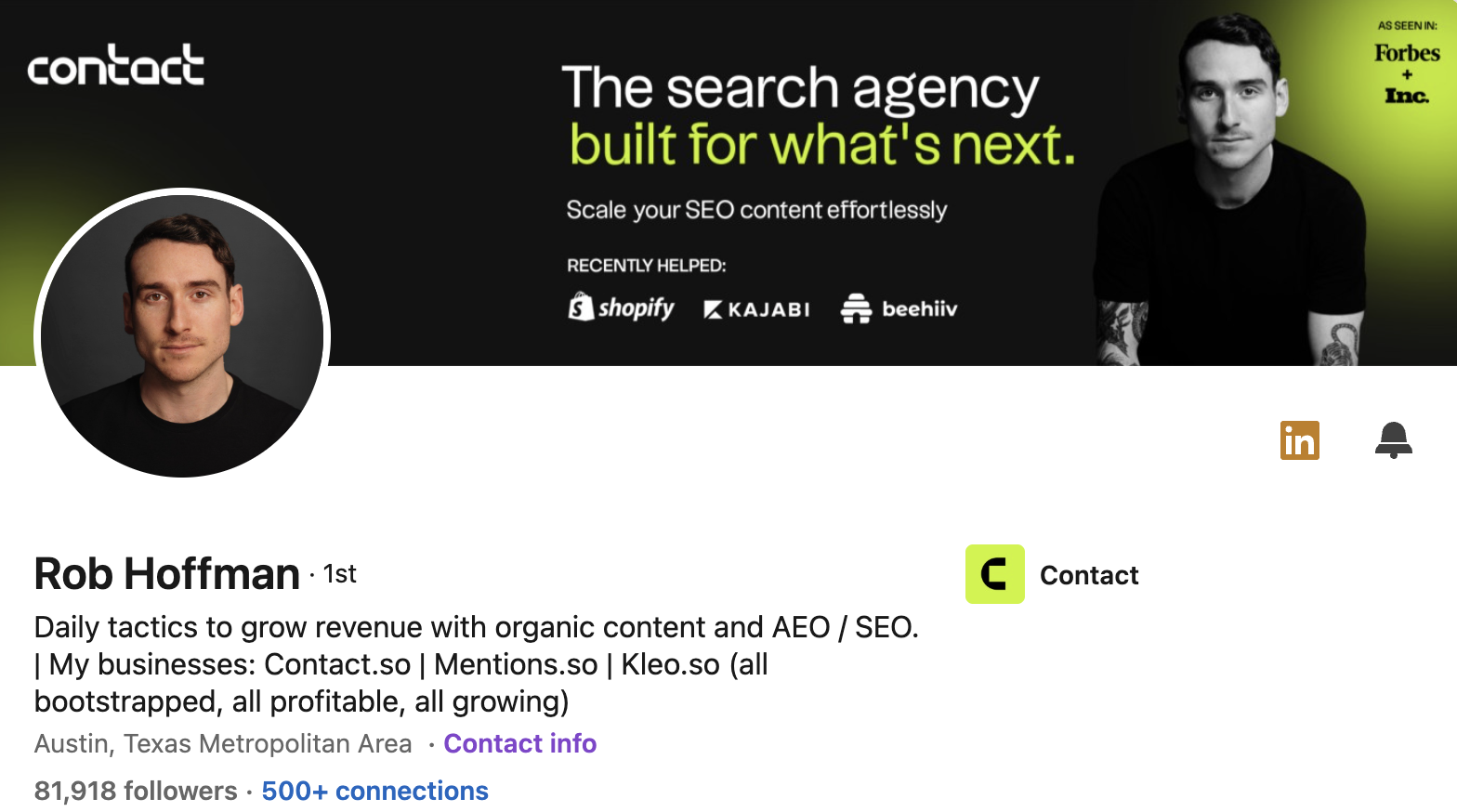
Rob, who's been featured in press around the globe, shows that he's got what it takes to grow your business.
His banner displays influence, trust and social proof. And also tells you exactly what he does!
15. Beatrice Vladut: Driving value proposition
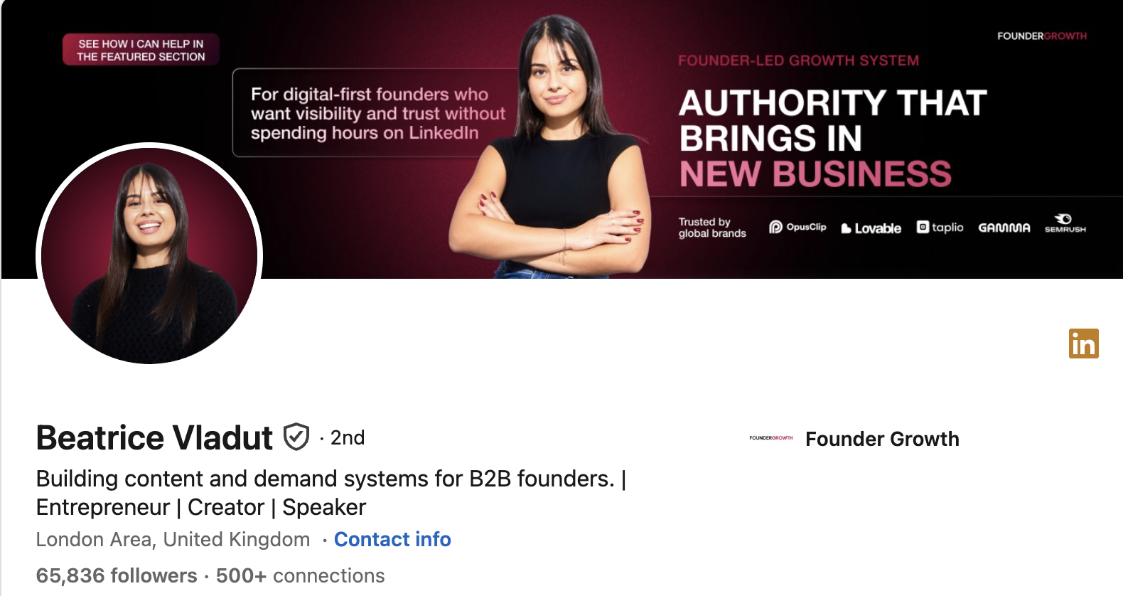
Beatrice leads with a value proposition built around one clear benefit. She resists the urge to cram in everything she does and picks the single most compelling thing. One strong message always beats five weak ones.
16. Marina Panova: Service offering
Marina frames her service offering around who it is for. By naming the audience, she makes the right visitor feel the banner was written for them. Specificity is what makes a service offering land.
17. Greg Isenberg: Podcast
Greg points visitors to his podcast. He uses the banner to grow a different channel and deepen the relationship beyond a quick profile visit. If your best work lives somewhere else, your banner should signpost it.
18. Diwas Basnet: Social proof
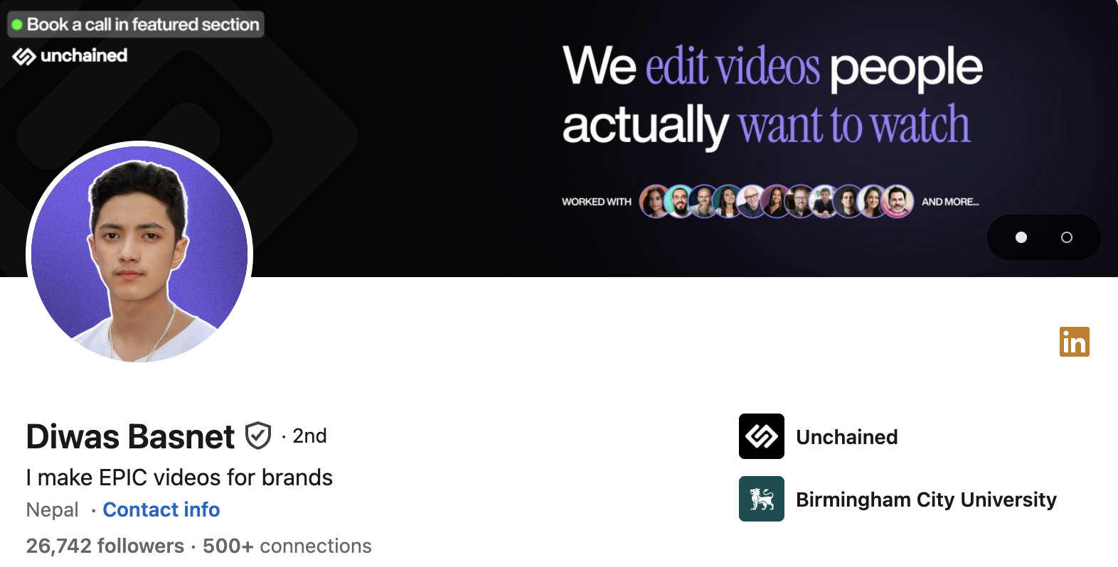
Diwas leads with social proof to build instant credibility. Rather than claiming authority, he shows it. Tangible evidence, like a follower count or recognisable names, is far more persuasive than any adjective you could write about yourself.
19. Ana York: Be Vibrant and Own Your Space
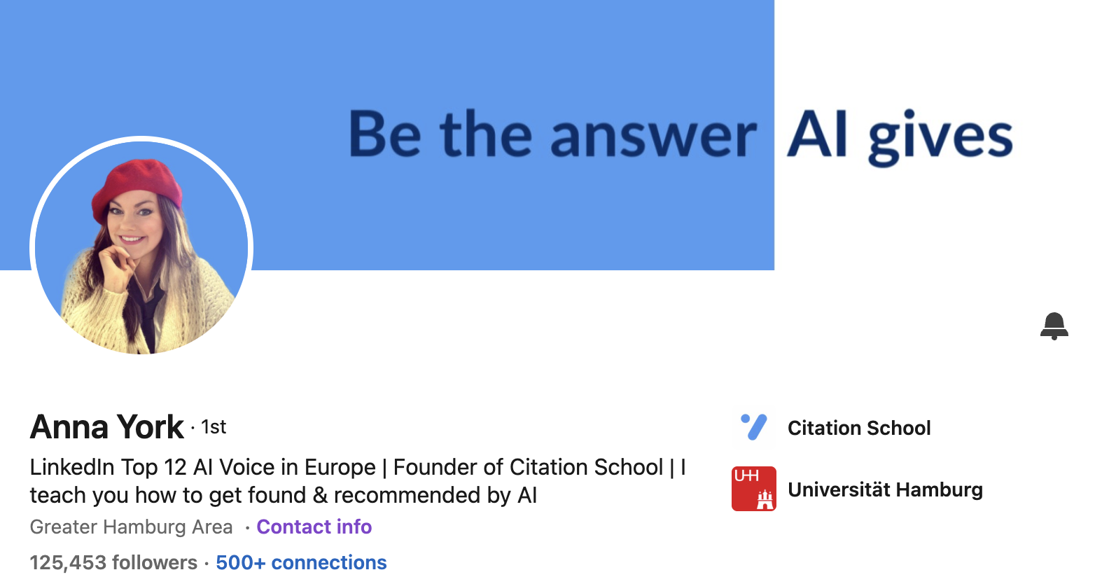
Ana is a Top Voice for AI in Europe and her banner shows that! It's powerful, vibrant and shows that she owns her space.
20. Steven Bartlett: OF Course!
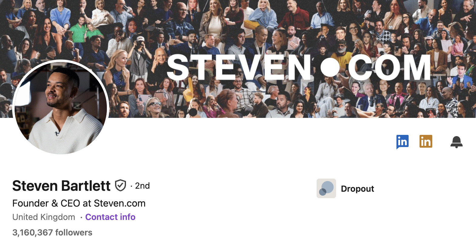
We couldn't leave out Steven.
He doesn't need any introduction - so he just tells you where to go. And displays his influence.
LinkedIn banner size and specs
Get this wrong and the best design still looks broken.
The correct size for a personal profile is 1584 x 396 pixels, a 4:1 aspect ratio. Company pages use 1128 x 191 pixels.
A few rules that save you:
- Upload as PNG or JPEG, under 8 MB. Use PNG if your banner has text on it, so it stays crisp. Zapier
- Mind the safe zone. Your profile photo covers the bottom-left corner. Keep that area clear, roughly 568 x 264 pixels, or your words get hidden behind your headshot. Reachly
- Keep key elements centred. On the mobile app the profile picture overlaps the banner and can cut off words, so check how it looks on your phone before you commit. Zapier
LinkedIn banner dos and don'ts
After studying what works across hundreds of profiles, here is the short version.
Common mistakes to avoid on your LinkedIn Banner
Even good designs get let down by basic errors. Watch for these.
- Saying too much. Crowding the banner with lines, skills, and buzzwords reduces clarity. One clear message works better than five weak ones.
- Putting text on the left. Your profile picture covers that space, so anything important placed there gets hidden.
- Going generic. Lines like "passionate professional" do not differentiate you and are easy to ignore.
- Low-quality images. Blurry visuals instantly make a profile look unprofessional. Export at full resolution and check it on a real phone before you commit.
How to build your LinkedIn banner
The fastest route to design your LinkedIn banner is a free design tool or a design service.
For the image itself you have a few options.
Your own photos are the most personal and need no design skill, just decent quality. Free stock photo sites work if you search with specific terms like "minimalist green desk" so you do not end up with an image a thousand others have.
And if you cannot find or design what you want, an AI image generator can build it from a description.
Then follow the simple checklist:
- one message,
- your key text centred,
- the bottom-left kept clear,
- and a final preview on mobile before you publish.
Final word
Your banner is the easiest high-impact upgrade on your whole profile. Most people ignore it, which is exactly why fixing yours pays off.
Pick the one job you want it to do, borrow the thinking from the example that fits you, and keep it clean. Then let it work for you on every profile visit, day and night.
A great banner gets people in the door. What keeps them is a feed worth following.
Once yours is pulling profile visits, the next step is posting consistently in a voice that sounds like you, which is exactly what Kleo is built to help you do.
Want to rock your LinkedIn? Get our
- LinkedIn Post templates,
- LinkedIn Carousel templates
- and hook templates
to get your audience engaging!